The end of last school year in the spring was so hectic that I was remiss in posting pictures. I promise to do much better this year.
I'm teaching all the grades again this year.
Thursday, August 30, 2012


Thursday, February 9, 2012
Fort Ross Drawings
A big part of the 5th and 6th grade year is an overnight to Fort Ross, an historic Russian fort on the California coast founded in 1812. So to dovetail into that curriculum, I had the kids do a drawing of the fort.


 Instead of otter pelt, I used paper bags. But I did have them use dip quill pens which add a nice feel to the project. To finish it off, they could use some white crayon to ad some highlights. For reference, they had a photograph and a vintage woodcut of the fort. This project involved a certain amount of perspective drawing.


Wednesday, November 9, 2011
Halloween pumpkins
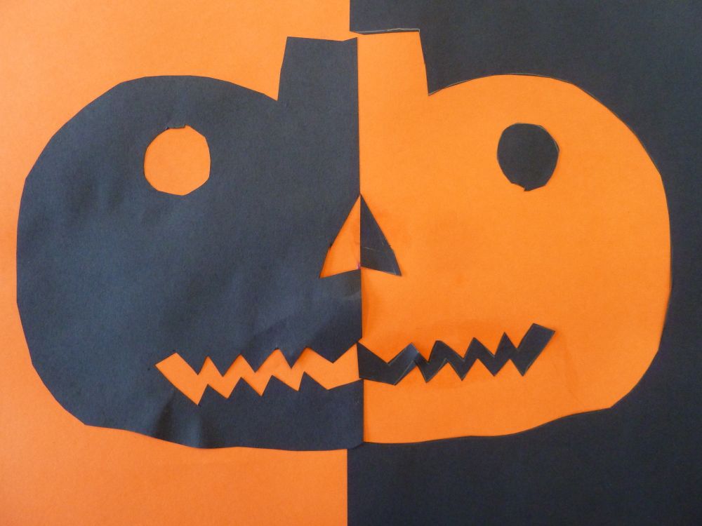
For the younger kids, I did a Halloween project that got great results a few years back: Positive / negative pumpkins with orange and black paper.
The key is having the kids learn that they can just draw half the jack-o-lantern on one piece and cut it out and then reverse it onto the other paper.
Quite a concept for the Kinders! But they had much more fun results than I imagined. Very cool stuff!


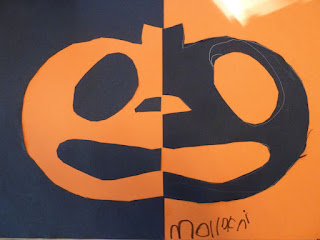


The key is having the kids learn that they can just draw half the jack-o-lantern on one piece and cut it out and then reverse it onto the other paper.
Quite a concept for the Kinders! But they had much more fun results than I imagined. Very cool stuff!
The Kindergarteners:


The 1st-4th graders



Kindergarten owls
In a repeat of a fun project from the past, we did Owls in the Kindergarten class. They were a hoot!
I do a directed drawing with the kids and then have them tear and cut paper to decorate their owls. It always amazes me how much personality comes out in these simple projects.


Sunflowers in glue and pastel
I've been doing quite a few multi-week projects the last month, so I have been remiss in posting. Sorry.
This project was done with all the kids in October, and took two sessions, so with my even/odd schedule it took a long time!
Since I've done Van Gogh sunflowers before, I wanted to do something different and involve more technique. The first step was to take some sunflowers in and have the kids "draw" with white glue! This is easy since I am using black paper. Once the glue dries it forms "lines" that the CHALK pastel does not stick. So basically the second week was a "fill in" project. The ones that turned out best use a lot of color and get good coverage.


Thursday, September 29, 2011
Self portraits with paper
The luxury of having a new batch of kindergarteners who have not taken art from me before, is that I get to revisit "ye olde arte projects of the past." Having taught for three years now, I have quite a few that I would repeat and this is one of them!
Here is a link to the project from 2 years ago!
No matter how simple or complex, it is amazing how distinctive and representative some simple cut and torn pieces of construction paper can be. Even Kinders can make their self portrait portray themselves.
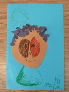


I have the kids pick background color and then some skin and hair color. They cut the face as a circle (or close) and then they can tear bits for hair. Add some eyes, nice mouth etc...
Here is a link to the project from 2 years ago!
No matter how simple or complex, it is amazing how distinctive and representative some simple cut and torn pieces of construction paper can be. Even Kinders can make their self portrait portray themselves.


I have the kids pick background color and then some skin and hair color. They cut the face as a circle (or close) and then they can tear bits for hair. Add some eyes, nice mouth etc...
Monday, September 26, 2011
Primary Color lesson
In my efforts to give the older kids an expanded art vocabulary, I did an early lesson on color. Notably primary, secondary, complimentary, warm and cool. I put up a color wheel and asked them to name the 6 main colors and gave them an overview that complimentary colors are opposite each other.


This was a brain teaser for many because there were several rules:
- Warm colors (red, orange, yellow) for the hand
- Cool colors (blue, purple, green) for the background
- I wanted them to have a pattern to their color choice so that they did not repeat colors next to each other. This led to some confusion, but if they kept inside the lines it worked okay.
- If a ring in the hand was orange, then the rest of the ring in the background needs to be the compliment: blue, etc.


Subscribe to:
Posts (Atom)