Showing posts with label primary colors. Show all posts

Monday, March 18, 2013

Warhol Zig Zag portraits


This project was kind of a three-in-one lesson

  1. self portrait with pencil
  2. color theory
  3. Pop Art/optical illusion

I was inspired by projects that I have seen that involve doing two similar but opposite drawings and then slicing them and putting them on accordian-folded paper.

I told the kids about Andy Warhol and his many technicolor portraits of celebrities. I also walked them thru drawing a face. We had already done an eye earlier in the year. The next step was to photocopy their pencil drawing, so they would have identical copies, and also not ruin their nice pencil drawing.


Once they had the two faces, they used colored markers to color the different parts of the face. My goal was to have complimentary colors like green/red hair, blue/orange skin, purple/yellow eyes. Then they had to fold/cut their portraits into 4 vertical strips, and alternate them on a larger piece of paper that could be accordian folded.


Monday, September 26, 2011

Primary Color lesson


In my efforts to give the older kids an expanded art vocabulary, I did an early lesson on color. Notably primary, secondary, complimentary, warm and cool. I put up a color wheel and asked them to name the 6 main colors and gave them an overview that complimentary colors are opposite each other.


For the actual project, I had gained inspiration from this art teacher blog.  I made a sheet of paper with radiating circles and photocopied it for the kids.  Then they traced their hand over this.


This was a brain teaser for many because there were several rules:
  • Warm colors (red, orange, yellow) for the hand
  • Cool colors (blue, purple, green) for the background
  • I wanted them to have a pattern to their color choice so that they did not repeat colors next to each other. This led to some confusion, but if they kept inside the lines it worked okay.
  • If a ring in the hand was orange, then the rest of the ring in the background needs to be the compliment: blue, etc.
This led to a certain amount of consternation and confusion, but after some minimal coaching it worked fine. I was really amazed at the level of sophistication that even the first and second graders showed! The results are truly cool!


Tuesday, November 9, 2010

Week 7: Henri Matisse collage


PANEL WITH MASK

1947
In my continuing efforts to introduce famous artists every so slightly into the curriculum, I talked to the kids about French artist Henri Matisse. He is a very famous painter, but at the end of his life, in the 1940s, became well known for his collage cutouts that he said were "painting with a brush."

I have done a bunch of drawing projects and emphasized line this fall, but this project had the goal of emphasizing several other things:
1. Abstract, graphic art
2. Color, with an emphasis on bright primary and secondary colors
3. Shape, with an emphasis on variety
4. Heirarchy, from large bold shapes to inticate small shapes
5. Layering of imagery to create dynamic compositions

To accomplish this, the kids were to pick two pieces of paper (one primary and one secondary on the color wheel) One of these was the background, the other was to be the large background shapes (Matisse often had background blocks of color). I tried to emphasize to the kids to make the large shapes alrge and bold and not too intricate. After they had done these two colors, they could choose two more colors from the scrap bin to use as medium and small shapes (Matisse had many smaller intricate shapes). I wanted the students to experiment with different shapes and not try to be literal.


Wednesday, November 3, 2010

Week 4: Stained glass names

For the younger kids who don't write in cursive yet, I did not do the cursive insect names, but instead did some straight-line stuff. I had the first and second graders use rulers and pencil to make several boxes ona piece of paper that corresponded to the number of letters in their names. We have a short-named group, so that is nice:-)

In each box I instructed them to draw uppercase letters and use straight, bold lines in black marker. I wanted the end result to be a box with multiple "windows: with positive and negative shapes. The use of line, and positive/negative shapes is a big focus of these frist two months.


In each "cell" created I told the kids to color one color and the final result is very graphic!

Friday, May 14, 2010

Week 29: Name Patterns and color


The kids like to doodle and draw, and I thought I would have them do some pattern and color work as well. My goal was to have them use two complimentary colors (ie: blue/orange, red/green, purple/yellow).


I had them use a marker to draw their name on a large paper. To that they added, like ripples of water, concentric rings that went outward from their name. The end result was kinda 1970's funky looking, but fun.

Then I had them use their watercolors, or crayons/markers, to fill in alternating stripes with their complimentary colors.

This was a very meditative process and the kids liked the result. I also gave them the choice to write the word MOM if they wanted, or their name was too long. Since Mother's day was coming up, they could give these little masterpieces to their mothers.

Wednesday, March 24, 2010

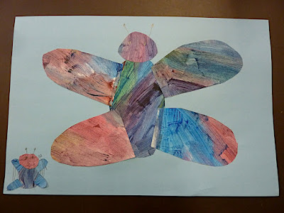
Week 24 & 25: Eric Carle Butterflies


It feels like its been a while since I posted, and that's because we did a 2-week project that was inspired by Eric Carle, the famous children's book author/illustrator of many beooks including the "The Very Hungry Caterpillar"


Week 1 involved making the paper to collage the next week. Carle used colored tissue paper to paint, but I had the kids work with large sheets of white construction paper.  They were given just the primary colors and told to mix and play with it on the paper and not in their pallete.  They also had toothbrushes for stippling and spatterings and forks for scraping. No rules, except that if they wanted more than one color to collage they needed to be mindful of making areas of distinct color combos and not overmixing to mud.  They achieved some very rich layered looks!

Week 2,  I gave each student their dried paper back and showed them samples of Carle's work again and then some simple digrams of how to make butterflies, bees and dragonflies from mostly just circles.


Some kids made big bold insects and many made flowers, while some made tiny little insects that seems to be swallowed by the page.  Most had little trouble figuring out what to do.


This turned out to be one of the best projects of the year. The color play with paint during the first step was very abstract and sensual, while they had to do some planning for their collage in step two. During the collage faze, they had to work with abstract shapes to make specific objects and also plan color, shape and size.  The end results are amazingly professional looking and really adhere to the spirit of Eric Carle. Good job kids!

Tuesday, September 15, 2009

Week 2: Primary color & pattern names


The first week was a representational self portrait. Week two was an abstract. My variation was to have the child write their name in black marker in a stylized fashion on the paper in big or small letters.

Then I had them add other black lines to form patterns and cells for coloring. I told them about the three primary colors and told them to fill the page with these three colors and pattern. I was amazed with the type of pattersn that they came up with. One child gripped all three colored pencils in one hand and scribled which added a very nice texture. Several took a long time making each pattern and cell very intricate, while others just went for it. Many did not finish in the 30 minutes that we have, but will finish over the week.

The fun thing was that the kids work ended up unintentionally looking like the work of Spanish painter Juan Miro. Here are some of his paintings:


Here is the work of a first grader!

Here is the work of a third grader!


Coming next week: Van Gogh Sunflower still life with an emphasis on warm and cool colors.